

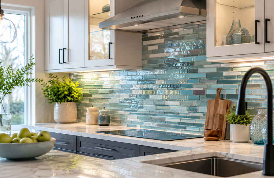
A kitchen backsplash may cover only a small part of the room, but it can influence the entire design. The right tile can brighten a work area, introduce color, and connect cabinets, countertops, flooring, hardware, and lighting in a way that feels polished rather than pieced together.
For homeowners in Lima, Ohio, glass tile offers plenty of flexibility. It can look crisp and modern, soft and subtle, or bold and decorative. The best choice depends on the kitchen’s natural light, fixed finishes, cleaning preferences, and how much attention you want the backsplash to attract.
At Simplified Flooring, homeowners can compare materials, review samples, and get personalized help with kitchen updates and full remodeling projects. Before choosing a tile from a small online image, it helps to understand how color, pattern, finish, grout, and lighting affect the final result.
Why Glass Tile Works Well in a Kitchen
Glass tile stands out because it interacts with light differently from many opaque materials. A glossy surface may reflect light sharply, while frosted or textured glass creates a softer glow. Some tiles also have subtle depth beneath the surface, which can make a simple color feel more layered.
That visual quality gives glass tile plenty of flexibility. It can support traditional kitchens with warm cabinetry, transitional rooms that mix classic and modern details, and contemporary spaces built around clean lines.
Glass tile can also connect different finishes. A backsplash may repeat a soft tone from the countertop, complement the warmth of the flooring, or create contrast with painted cabinets. It does not need to match every material exactly. A coordinated palette usually feels more natural than one where every surface looks identical.
Many glass tiles have a smooth surface that is straightforward to wipe after everyday cooking. Grout lines still need attention, and textured glass may take more care than flat tile, but the overall surface can work well in busy kitchen areas.
Start with the Kitchen’s Fixed Features
Before looking at tile colors, begin with the materials that are likely to stay in place for years:
Cabinet color and wood tone
Countertop color, veining, and movement
Flooring color and pattern
Appliance finishes
Faucet and cabinet hardware
Wall color in nearby rooms
Natural and artificial lighting
A tile that looks perfect in a showroom may feel very different beside warm oak cabinets or a heavily veined countertop. Place samples directly against the counter and cabinets, then view them from across the room and up close.
Undertones matter. White tile can lean warm, cool, gray, blue, or cream. Beige can have pink, yellow, or gray undertones. Even clear glass may pick up color from the wall, adhesive, grout, or nearby finishes.
Instead of asking only, “Which tile do I like best?” ask, “Which tile works best with the materials already in this kitchen?”
Choosing a Glass Tile Color
Color sets the mood of the backsplash. It can make the design feel bright and open, warm and welcoming, calm and natural, or bold and dramatic.
Neutral Glass Tile
White, cream, taupe, beige, greige, and soft gray are flexible choices. They can support many cabinet and countertop combinations without taking over the room.
Neutral tile does not have to feel plain. Interest can come from a beveled edge, frosted finish, vertical layout, herringbone pattern, slight color variation, or contrasting grout.
For white cabinets, soft gray or creamy glass can add definition without creating a sharp break. With wood cabinets, warm neutrals may feel more connected than a bright cool white.
Blue and Green Glass Tile
Blue and green can introduce color while still feeling calm and livable.
Consider:
Soft blue-gray for a relaxed appearance
Navy for strong contrast
Muted sage for a warm, natural feel
Aqua for a fresh, airy look
Teal for a richer focal point
Deep green for a dramatic accent
If the countertop already has strong movement, use a simpler shape and quieter shade. In a mostly neutral kitchen, a deeper blue or green can become the feature that gives the room personality.
Warm and Earth-Inspired Shades
Amber, bronze, sand, clay, muted gold, and warm brown can complement natural wood, warm stone, and traditional finishes.
These colors can also look modern when used in a slim stacked tile or large-format layout. Shape and finish influence the mood as much as color.
Light Versus Dark Tile
Light tile often reflects more visible light and supports an airy look. Dark tile creates contrast and depth, especially beneath light cabinets or behind a range.
Dark glossy tile may show splashes, fingerprints, and water marks more clearly under direct lighting. That does not make it a poor choice, but it is worth seeing a sample in the actual room before deciding.
Patterns That Change How the Kitchen Feels
Pattern affects how the eye moves through the room. It can make the backsplash feel calm and orderly, draw attention upward, or create a strong focal point.
Classic Subway Tile
Rectangular subway tile remains one of the most versatile options. A traditional offset pattern feels familiar, while a straight stack looks cleaner and more contemporary.
Larger subway tiles create fewer grout lines and a quieter surface. Smaller tiles add more repetition and detail.
Vertical Stacked Tile
Turning rectangular tiles vertically draws the eye upward. This layout works well beneath tall cabinets, behind a range hood, or in a kitchen where homeowners want a fresh architectural effect.
Herringbone and Chevron
Herringbone uses rectangular tiles arranged in an interlocking zigzag. Chevron uses angled ends that meet to form continuous V shapes.
Both patterns create movement and work well behind a range or inside a framed feature area. If the countertop already has bold veining, use these patterns carefully so the surfaces do not compete.
Glass Mosaics
Mosaics use small tiles mounted together in sheets. They may feature one color, several related tones, mixed finishes, or glass combined with stone.
Common styles include small squares, mini bricks, penny rounds, hexagons, and linear strips. Always step back from a mosaic sample. Details that look subtle up close may create a much busier pattern across an entire wall.
Large-Format and Feature Tile
Larger glass tiles create a calmer appearance with fewer grout lines. Because reflective surfaces may make uneven walls more noticeable, careful preparation and precise installation are important.
You can also use a patterned section behind the range while simpler tile covers the rest of the backsplash. A narrow color band, framed mosaic insert, vertical panel, or full-height area around a range hood can add interest without overwhelming the room.
How Finish and Lighting Change Glass Tile
Color samples alone do not tell the full story. The same shade can appear brighter, darker, warmer, or cooler depending on the tile finish and the room’s lighting.
When comparing a glass tile backsplash, look at how the sample responds to daylight, ceiling fixtures, pendant lights, and under-cabinet lighting.
Glossy Glass
Glossy glass has a crisp, reflective surface. It can bounce light across the backsplash area and create a polished finish.
This can help a kitchen feel visually brighter. The tradeoff is that glossy surfaces may show smudges and water spots more clearly, especially under direct light.
Frosted, Matte, and Textured Glass
Frosted and matte finishes soften reflections. They still offer the depth of glass but create a quieter look.
Textured glass creates highlights and shadows, while iridescent glass may shift slightly in color as the viewing angle changes. Both can be beautiful, but they are visually active, so use them thoughtfully when the countertop or cabinetry is already detailed.
Natural and Artificial Light
A tile may look different throughout the day. Morning light can feel cooler, while late afternoon light may bring out warmer tones. Seasonal changes matter too. A backsplash that looks bright in summer may feel quieter during shorter winter days.
Under-cabinet lighting is especially important because it shines directly across the backsplash. Warm bulbs often bring out cream, amber, and gold undertones. Cooler bulbs may emphasize blue, gray, and green.
Test samples under the lighting that will be used in the finished kitchen. It is one of the easiest ways to avoid surprises.
Pairing Glass Tile with Cabinets and Countertops
Cabinets and countertops sit directly beside the backsplash, so they have a strong influence on the final choice.
White, Wood, Dark, and Painted Cabinets
White cabinets can work with almost any glass tile color. Soft blue, sage, gray, clear textured glass, and navy are all strong options. The key is choosing an undertone that feels connected to the cabinet finish.
Natural wood often pairs well with warm neutrals, muted green, soft blue-gray, bronze, and sand tones. The tile does not need to repeat the wood color. It can simply share the same warmth or create a gentle contrast.
Dark cabinets may benefit from lighter reflective glass, while painted navy, green, or charcoal cabinets often look best with a quieter backsplash. For two-tone cabinetry, choose a tile that connects both colors rather than matching only one.
Quiet Versus Busy Countertops
A heavily veined or speckled countertop already provides a strong pattern. Pairing it with a busy mosaic or high-contrast herringbone layout can make the room feel crowded.
For a bold countertop, consider:
A simple tile shape
One restrained color
Low-contrast grout
A soft glossy or frosted finish
Larger tile sizes
For a quieter countertop, the backsplash can carry more personality through color, pattern, or texture.
One practical approach is to identify a subtle tone in the countertop and repeat it in the tile. It does not need to be an exact match. Related undertones are often enough to make the materials feel connected.
Connecting the Backsplash to Flooring and Hardware
Flooring affects the kitchen’s overall warmth and visual weight. Warm wood or wood-look flooring often works with creamy neutrals, amber glass, muted green, or soft blue. Cooler gray flooring may pair well with white, charcoal, blue-gray, or clear textured glass.
Try not to make the flooring, countertop, and backsplash equally busy. If one surface has a strong pattern, let another provide visual rest.
Hardware and fixtures also matter. Reflective glass may pick up stainless steel, chrome, brass, bronze, or black accents. The metals do not all need to match, but the combination should feel deliberate.
Create a simple sample board with the tile, cabinet finish, countertop, flooring, grout, and hardware. View the group in the kitchen rather than judging each item separately.
Practical Decisions Before Installation
Once the style is clear, a few practical choices will shape the finished result.
Decide How Much Wall to Cover
Common backsplash layouts include:
Countertop to upper cabinets
Full height behind the range
Up to the ceiling around a range hood
A focused section behind the sink
A complete feature wall in an open kitchen
Extending tile higher creates a stronger statement. A standard-height backsplash may feel quieter and keep more attention on the cabinetry or countertop.
Choose Grout Carefully
Grout changes how clearly the tile shape appears.
Matching grout creates a more continuous surface.
Contrasting grout emphasizes the layout.
Mid-tone grout offers balance and may make everyday discoloration less noticeable.
With translucent glass, setting materials and grout may influence the final appearance. Compare the tile and grout together whenever possible.
Plan Edges, Corners, and Outlets
Exposed edges, outside corners, window trim, switches, outlets, and transitions to painted walls all affect the final look.
Discuss these details before installation begins. Early planning can reduce awkward cuts and help the finished backsplash look complete.
Confirm Installation Requirements
Glass tile may require specific setting materials, cutting methods, and wall preparation. Transparent glass can reveal adhesive lines, while detailed layouts require precise alignment.
Professional installation can be especially helpful for large-format glass, mosaics, full-height features, uneven walls, and projects with many corners or outlets.
Common Questions About Glass Tile Backsplashes
What Color Makes a Kitchen Look Brighter?
Light neutrals, pale blue, soft green, and clear or lightly textured glass often reflect more visible light. Glossy finishes may also make the backsplash area feel brighter.
The best choice still depends on the surrounding materials. A pale tile with the wrong undertone may feel less cohesive than a slightly darker tile that fits the room.
Does Glass Tile Reflect Too Much Light?
It can, especially when glossy or iridescent tile sits beneath strong directional lighting. Frosted, matte, or softly textured glass reduces sharp reflection while keeping visual depth.
What Backsplash Works with a Busy Countertop?
A simple tile shape, restrained color, and low-contrast grout usually work well. Let the countertop remain the main feature and use the backsplash as a calm supporting surface.
Is Glossy or Frosted Glass Better?
Glossy glass creates stronger reflection and a polished look. Frosted glass produces softer light and a quieter appearance. Neither option is automatically better.
Does Grout Color Change the Appearance?
Yes. Matching grout allows the tile color to dominate, while contrasting grout makes the shape and pattern more visible. Grout has an even stronger effect on mosaics because they have more grout lines.
Are Glass Mosaics Hard to Maintain?
Smooth glass is generally straightforward to wipe, but mosaics contain more grout lines. That means grout care becomes a bigger part of maintenance.
Create a Kitchen That Feels Thoughtfully Finished
The right glass tile backsplash is not simply the trendiest option. It is the one that supports the kitchen’s lighting, color palette, practical needs, and personal style.
Before making a final choice, ask:
Does the tile coordinate with the cabinet and countertop undertones?
Does it look appealing in daylight and evening light?
Is the pattern balanced with the other surfaces?
Does the grout create the effect you want?
Have edges, outlets, and feature areas been planned?
Have you viewed a physical sample in the kitchen?
Glass tile can be subtle, colorful, reflective, textured, traditional, or modern. It can brighten a darker work area, introduce a carefully chosen accent, or help several finishes feel connected.
When you are ready to compare samples, plan a backsplash, or coordinate a larger kitchen remodeling project, get in touch with the Simplified Flooring team. Knowledgeable guidance can help turn your ideas into a beautiful, practical kitchen that feels right for your home.


